
S
ometimes a space just needs a little pick-me-up. That's how I felt about my foyer. Actually, I've never really put much thought into the space even though it's the first area seen when walking through the front door.
No doubt ignoring your foyer will get you an "F" in most Decorating-101 classes. So I decided to apply some long overdue changes to this area.

Last year, I had a carpenter add some architectural interest to the large blank foyer walls with these molded boxes with scalloped corners.
I've seen this effect in magazines and always admired how the technique adds definition and interest to an otherwise plain, boring wall space.

A little color goes a long way and sure beats the original, ivory paint. I chose Lenox Tan (HC-44) by Benjamin Moore which has a rich, khaki-colored tone.
While researching paint colors, I read an online review of Lenox Tan which referred to it as "one of the most overused colors ever".
If that's true, I can see why because it's a great color that reads quite neutral and goes with just about any adjacent room color.

I was originally going to have the interior of the boxes painted the same color as the wall. However, one of the painters suggested I try using Ralph Lauren's Suede textured paint to create some contrast.
NOTE: I was lucky to find two of the most fabulous, good natured, professional painters ever (pictured above). They delivered clean, superior work and their paint lines were straight-as-an arrow. All free hand too with nothing taped off. Amazing results. Skilled painters really make a big difference, so choose carefully for large/detailed jobs like this.
The Ralph Lauren textured paint used to be widely available at Home Depot but has now been replaced on the shelf with Martha Stewart's paint line.
I also had a powder room painted with this same effect. You may have to call the Ralph Lauren company directly to get an up-to-date listing of the independent retailers who carry this paint in your area.

This is such a cool effect. It really does look just like a suede with a soft, textured appearance. This particular color is called Fawn's Leap and is a tad darker than the Lenox Tan.
Here's a close-up of the paint effect. It may be a little hard to make out in the photo but there definitely is a light texture up close and from a distance it looks very much like suede.

I wanted to frame the front door with some decorative elements and I found several of these 12 X 12 wall plaques at an antique store. I love the grated, floral detail.
However, when I held the plaques up on the wall, the charcoal color made them look too dark and heavy for the space.
Of course, that's an easy enough fix.

I didn't bother priming the plaques, I just painted several coats of Lenox Tan over them.
I also made sure that some of the original dark color remained for a little contrast.

I definitely lean toward a more monochromatic look when it comes to home decor so I liked the idea of painting the plaques the same color as the walls.
This works for me and I really like the way the floral design has a very subtle presentation.

Initially, I thought it would be nice to create a symmetrical look on the other side of the front door. However, a large switch plate threw off the potential visual balance.
Instead, I found a similar but larger decorative plaque to use in the space. It was off-white so I had to spray paint it charcoal gray first, and then apply the Lenox Tan paint to get the same look as the trio of smaller plaques on the other side of the wall-

I'm really pleased with how well the wall plaques look even though though the large plaque obviously did not come from the same source as the smaller ones.
I think the designs are close enough and painting them all the same color helps the arrangement work in this space.

I also wanted to fill the ledge above the door with something visually appealing.
I've held on to these old vases for years hoping to be able to put them to good use one day. They were originally a yellowish color and it didn't occur to me until recently that I could simply paint them to blend in better with the rest of the decor.
The horse statue was re-located from another room and coincidentally has the same grate-like pattern as the wall plaques.

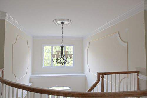
Meanwhile, the moulding adds a totally new dimension to the walls. When walking into the space from the front door, here's the view looking up to the left.
NOTE: The color on the walls in the room beyond the foyer (dining room) is called Spanish Red (1301) by Benjamin Moore. This room is also an on-going work in progress. I'll share photos of my dining room transformation later in an upcoming post.

Here's a look at the moulding on the opposite foyer wall. I think the contrast created by the addition of moulding and Lenox Tan combined with the darker, textured paint really works to bring the wall alive.
You may recall seeing how the room with the olive colored walls was transformed last year into a comfortable, attractive music room.

Here's a look at the moulding on both walls.

I'm still working on a handcrafted tablecloth for a pedestal table that will sit on the side of the foyer staircase.
The alcove-like space is so empty (except during the holidays when I put my Christmas tree here) and it definitely needs to be filled with a permanent decorative element.
I've narrowed down a few tablecloth fabric choices already, so I'll soon be able to get started on that project which I'll share later in an upcoming post.

Meanwhile, here's one more look at what the foyer looked like before the new paint, moulding and wall decor.
Here's a look at the foyer now.
I think a nice window treatment above the ledge would be the way to add to the space. I'm still searching for a suitable solution that will add the right amount of color and form without obscuring the natural light that pours in from the window.
Hmm, valence or panels?

For me, home decorating always seems to be a work in progress that is rarely ever truly complete.
There are always new ideas and decorative elements that can be introduced and/or re-located and the end product can take months, even years to get just right.
So far, I'm happy with how this space is shaping up. While there is more foyer tweaking to be done, at least this feels like a really good start. I'll keep you posted. ♥

Lisa, you have a beautiful home. And the foyer transformation is very inviting. Thanks for sharing your ideas and techniques.
It came out so well! Nicely done!
Very nice!!! I really like the wall colors. Surprising, since, I am not a fan of beige. It looks so warm and inviting compared to the “Before.” Really well done, Lisa.
Wow Lisa! Your new foyer is just gorgeous! I LOVE the suede insets. Boy, what an inspiration — I’ve just stripped the wallpaper from our foyer. Ours isn’t nearly as interesting as yours though — more like a big vertical box with almost no wall space except for the walls that are above the 9 foot high level. I love your paint color though and that’s probably the direction that I’ll be heading! I can’t wait to see your continued progress on your home!
Looks FANTASTIC!!!
Stunning Lisa. That suede added a rich, rich tone. I would not have thought to paint the plaques if I had come across them. You should have a show or book….
What a warm, beautiful, welcoming space in your home. Love the wall plaques.
Absolutely stunning!!! Kudos on a job well done!
This is absolutely beautiful! I hope to be able to learn how to develop creativity like you have here. It’s gorgeous! If I use http://liberatingyou.com/develop-a-creative-thinking-mindset/, I think I will get somewhere. I love this so so much.
Hi Lisa Its so so beautiful home. I liek this home so much. Its look very rich and cool. And in this home have more space.
Exquisite.
Thanks for sharing!
Your home is like dream for every one. You allot fantastic pix of your home. Its too good.
Looking to do the exact picture moulding in my foyer and stumbled upon this website. Looks beautiful. Where did you get the curved corner mouldings.
This is just beautiful ! Can I ask where you got your chandelier ?
Can you tell me where you got the chandelier ?
Beautiful! Where did you get the chandelier?
Tring to figure out where chandelier was bought?
i would like to know what is the color of the trim color thank u very nice
Hi Michelle, the trim color is really just a bright white gloss. The suede color is called Fawn and it’s a textured paint by Ralph Lauren. The walls are Lenox Tan by Benjamin Moore. Hope this helps. Good luck with your project.
What is the color in the adjacent room? Looks like a shade of green. Goes well with this color.
Hi James, the color you referenced is called Hancock Gray by Benjamin Moore HC-97.
While the color is called “gray”, I think it’s more of a muted olive color. It compliments the rich khaki-like, Lenox Tan (Benjamin Moore HC-44) that is on the adjacent walls.
You can see more of the Hancock Gray and the transformation of the space in my earlier post here: https://celebrate-creativity.com/my_weblog/2017/05/music-room.html
Good luck with your painting project.
Happy holidays.
I love this. I too was wondering if you could share where you got the chandelier.
I was able to find the Lenox tan but I’m having difficulties finding the fawn leap help me please your foyer is beautiful
Hi Sherri, the suede finish if a Ralph Lauren product and I think you have to go to their website to find an authorized dealer who carries the paint in your area. That’s what I did and the dealer mixed the paint right there after I picked the color I wanted.
Here’s the link to the RL paint website. I think you enter your zip code and authorized dealers will pop up near you. There’s also a video on this site which deals with how to apply the paint properly.
http://www.ralphlaurenpaint.com/specialty_finishes/suede
Good luck with your project and let me know how it turns out for you.
I’m so depressed that Home Depot no longer carries this paint:( I’ve used the suede, Linen, Leather faux finishes and they are the BEST! I’ve used MANY paint brands over the past twenty years, and theirs truly is one of the best! It’s even hard to say that considering that I’ve used Benny Moore forever. When we built our home, I decided to paint my Laundry Room cabinets with Ralph Lauren, and painted all of my wood work with Benny. Guess what? Ralph rocks the house! To date, I still regret using Benny on our woodwork, and that’s saying something! Your home is absolutely stunning, Lisa! Just beautiful:)
Oh, thanks so much Cindy.
I appreciate that, especially today when I look around and everything looks like a tornado came through-lol.
Happy Sunday and have a lovely week.
Love love love this foyer space!!! Can you please tell me if the wainscoting is only an outside border or there is a wooden board as well to create the effect that you have in white on white ?
Thanks so much DJ. There are no wooden boards and the white area under the chair railing is just plain wall, painted white.
Same thing for the large molded box on the upper wall. Nothing inside the box except wall that has been painted with textured paint effect.
Good luck with your project and happy weekend.
Hi. I would like to know the name of the company who did the molding boxes in the foyer for you?
I love this foyer! Can you tell me where the chandelier came from?
Thanks!
Thanks, Sari.
This chandelier was part of a lighting package that was purchased along with the house.
I did buy a similar one at a lighting store a few years ago.
You probably won’t find one you like this at a big box store like Home Depot for example.
I would check the listings in your area for an independent lighting store and you may be able to find what you’re looking for.
Good luck and thanks for popping over for a visit.
Beautiful transformation! Did you also change the color of your wood flooring and the stained wood banister railing? The stained wood in the before and after photos look different. If you did change the wood color, please let me know how you did it–I’m wrestling with what to do with my orangey-looking oak trim. Thanks!
Hi Donna, thanks so much.
The difference in color is just lighting.
I also struggle with that “orangey-looking oak trim. The trend is toward much darker woods now and I love the darker look.
Sadly, I think it would cost a fortune to re-stain the floors and all the trim throughout my house now.
I know it can be done but I’ve heard it’s a pretty pricey proposition.
Good luck with your efforts.
Any idea on where you got the carpet in the finished picture of the Foyer? I am in love with the Foyer overall! Beautiful job!
Hi Jen, thanks so much.
I purchased the rug many years ago from a furniture store called Haynes.
At the time, there were coordinating 8′ x 11′ area rugs too.
I hope you’re able to find what you’re looking for.
Happy day to you.
Hola me podrás dar el nombre de los 2 colores que usaste en tu pared están muy relajantes y muy hermosos se ve hermosa tu combinación
Hola Luis, el color en las paredes se llama Lenox Tan (HC-44) de Benjamin Moore.
El color de faux suede dentro de las cajas moldeadas se llama Fawn de Ralph Lauren. Es una aplicación de pintura con textura y si la usas, te sugiero que practiques en una cartulina primero para asegurarte de saber cómo obtener la textura adecuada. Todo está en el movimiento de la mano. Buena suerte con tu proyecto de pintura.
Hi Luis, the color on the walls is called Lenox Tan (HC-44) by Benjamin Moore.
The faux suede color inside the molded boxes is called Fawn by Ralph Lauren.
It’s a textured paint application and if you use it, I suggest you practice on a poster board first to make sure you know how to get the proper texture. It’s all in the hand movement.
Good luck with your painting project.
Your foyer looks amazing. My wife is trying to create the same molded box with the scallop corners and is striking out finding the molding. Can you tell me what type of molding you purchased and where? Thanks in advance
Hi Dennis, so glad you like the molding.
I actually don’t know what type of molding it is. I hired a local contractor who installed everything for me but he did not discuss what materials he was using.
I’m sorry I can’t be of more help to you. Good luck finding what you’re looking for.
Hi. What’s the name of the company you hired?
Hi Lisa ,,love you decorating ideas !
I am very much a neutral type of girl ,I like a pop of colour in my decorating,,but I’m struck on neutral tone walls . We have an open concept home ,,with a half wall in our small living room which boxes in the basement stairs,,which I dislikebecause it gave us an awkward little jut of space which I have no idea what to do with. I would be so gratefulfor any suggestions .
Sincerely Kim
Hi Kim, I’m honored you would even ask for my advice.
Would you be able to email me a photo of the space you’re talking about.
I’m happy to take a crack at some suggestions but I’m having trouble visualizing it from just your written description.
Thanks and have a nice day.
Hi Lisa, your home is very beautiful, I especially like the detailed molding around the doorways. Ive been struggling with paint colors for a year now, that’s how long we have been in our new home. we have a 2 story entry and 2 story family room. I was wondering what color green you used in your livingroom? Id also be interested in aany other recommendations you can make. Thank you so much, I Love it!
Hi Sandy, the color green in my living (music) room is called Hancock Gray. It’s by Benjamin Moore(HC-97) and it really is more of an olive than a gray. The “HC” in the color description stands for Historic Color.
I paired the Hancock Gray with another HC color called Lenox Tan (HC-44) for nearby foyer and rooms.
These 2 HC colors work very well together. I think the HC line is designed that way so they all compliment each other. They tend to be richly hued tones with a muted almost matte looking finish (even though I used satin finish).
When I was deciding on paint colors, I purchased some small containers of the colors I was considering and I painted them on large poster boards. Then I put the boards up in the room and observed how they looked throughout the day and evening.
This way, I was able to get a sense for how the colors would work in different light.
I think at the height of my decision making, I had 10 different painted boards-lol.
I’m no expert but the other think I would consider is to stick with fairly neutral tones. Use accents, furniture, pillows, etc. for your pops of color. This will allow you to change your decor often for a new, fresh look rather than having to paint everything again.
It also may help with resale (not that you’re considering that) if the entry and 2 story areas are a neutral color with universal appeal as opposed to overly customized shades
I hope this helps. Drop me an email for any more info if you like.
Did you use bright white gloss on the lower walls and molding? Was it Benjamin Moore? I do love the colors and how easy the eye moves from one room to the next. Excellent!
Hi Debbie, thanks so much for you kind words about my foyer.
I used a satin white on the lower molding walls. It was not Benjamin Moore. I’m sorry I don’t know what color white because it was what the painter brought with him.
However, the walls are Lenox Tan (HC 44) by Benjamin Moore.
I hope that helps.
Happy day to you.
I just love your colors you used. I am so glad you posted the before and after pictures. I have a open foyer that walks into the living room with. What color would you suggest? I’m terrible with picking colors. Where do I go to find the picture of the room with the olive color? Your house is amazing you should be a home decorator.
Hi Sherry, thanks for your kind words and I’m glad you’re inspired by my foyer choices.
I’m partial to a color flow from room to room where the hues have the same tone. The two dominant colors in my home are Lenox Tan and Hancock Gray which is more of an olive color. They’re both part of Benjamin Moore’s Historic Colors paint line. In fact all the colors in that line work well together. Lenox Tan is HC-44 and Hancock Gray is HC-97.
Here’s the link to my music room that features the Hancock Gray: http://celebrate-creativity.com/my_weblog/2017/05/music-room.html
Hope that helps.
Happy weekend to you.